
Lucidchart
Template Picker Re-Design
The Team: Ruoxun Chen, Taraneh Ekbia, Anany Maini, Kailin Yang
UX Design | IU | Fall 2017
Problem Space
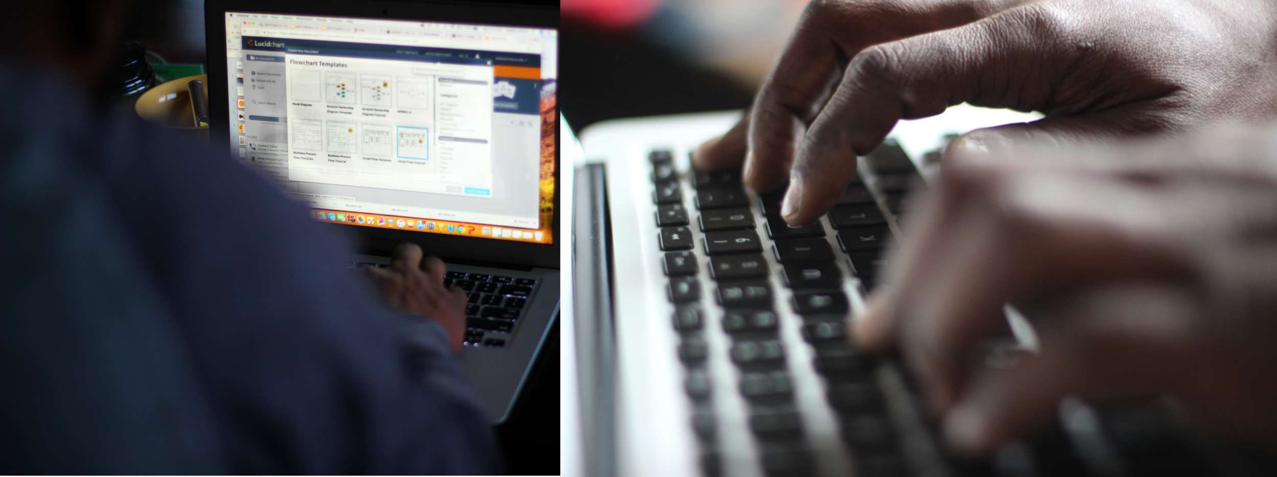
Our challenge was to tackle the Template Picker in Lucidchart, an online diagramming platform that provides users with the space to create diagrams, whether from templates or from scratch. Specifically, we were asked to focus on the Template Picker, a pop-up window listing different templates in various template categories. While Lucidchart provides a variety of options for users as far as their Template Picker experience, the problem was not presenting these options in a way that gave users what they needed, when they needed it.
Ultimately, the goal of our project was to bring people back to Lucidchart after their 7-day free trial. But this could only be done if users were successfully shown the potential of the Template Picker and how this site and these specific templates would fit their diagramming needs.
We asked ourselves...
"What change could we make to the Template Picker that would encourage users to continue using Lucidchart and its templates?"
Proposed Design
After moving through various concepts, we ended up settling with what we found to be our most practical and minimalistic. We wanted to tend to the needs of both new users and old.
This change would be one that new users would easily pick up on, and old users will not get confused over.
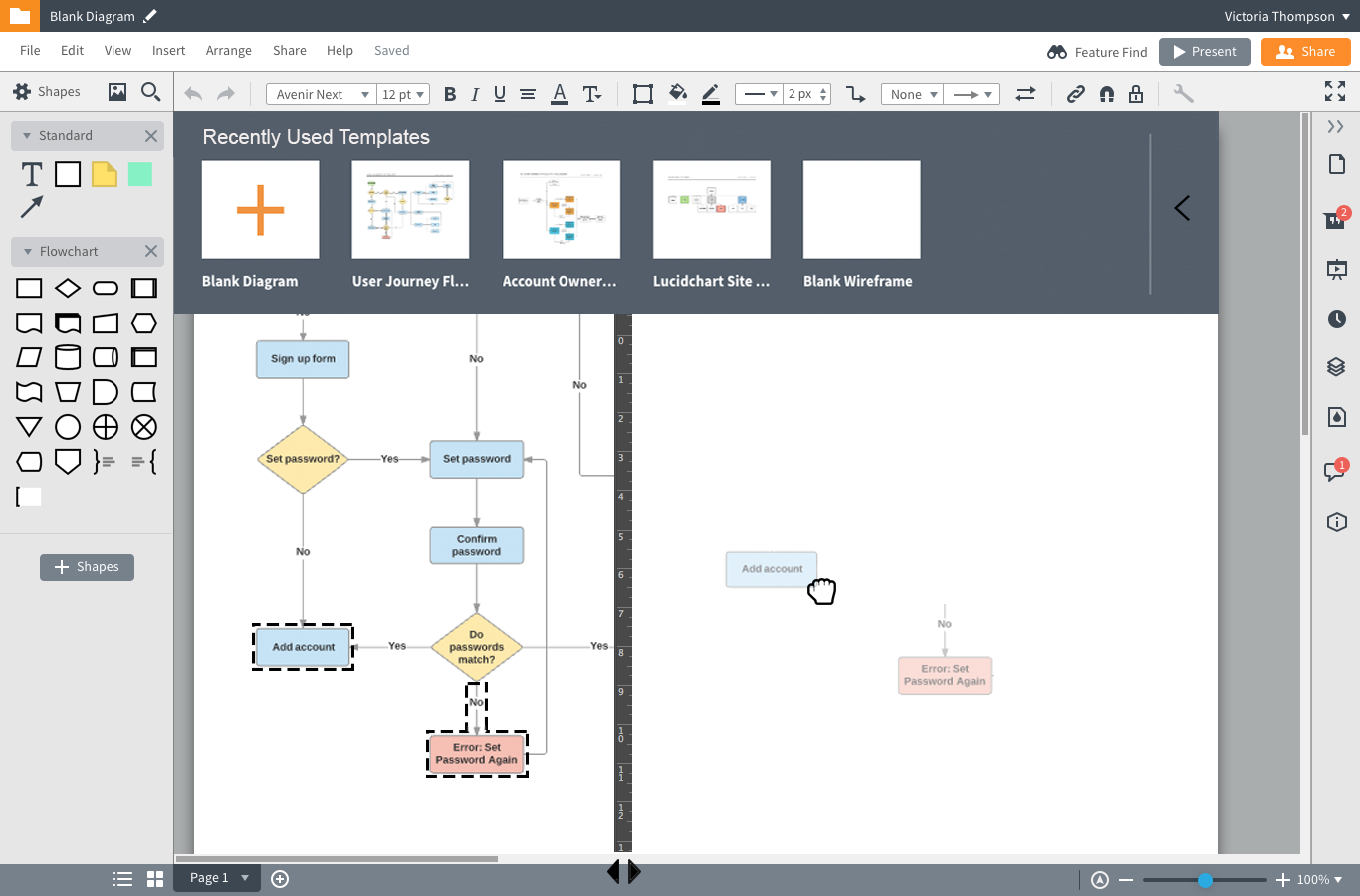
By using the sliding bar at the top of the Template Picker, users would be able to shrink or enlarge thumbnail images to get a better idea of the templates that are available to them.
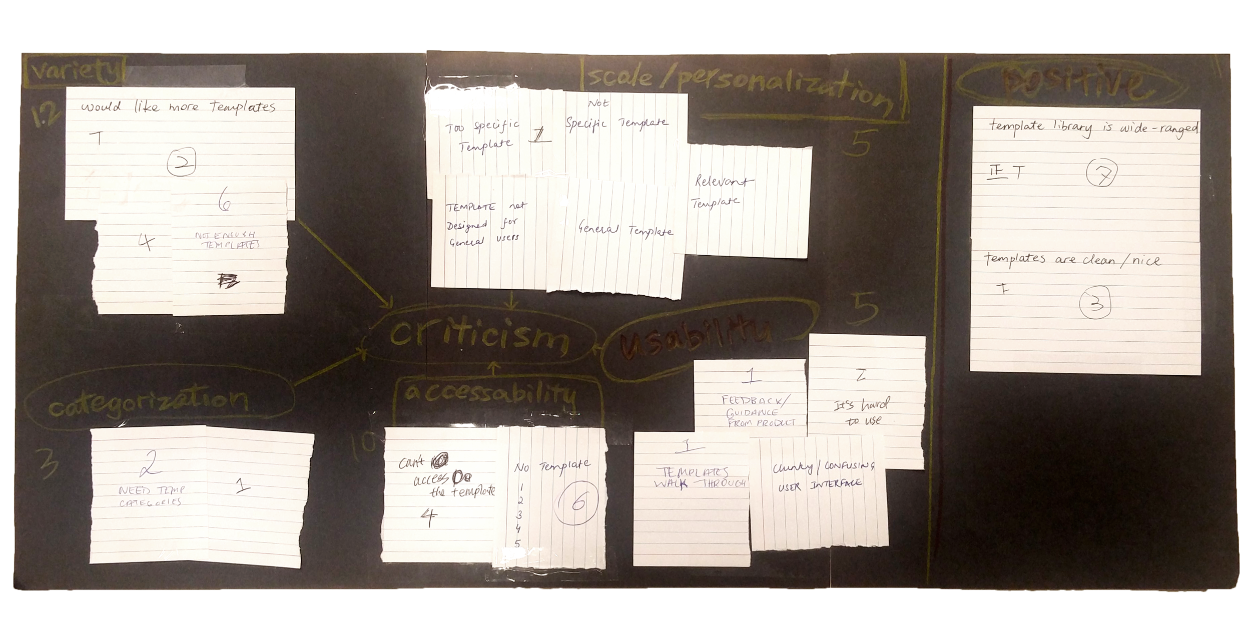
The Data
All of our data was provided by Lucid through their own surveys and studies, as well as A/B testing of certain features.
Patterns in data...
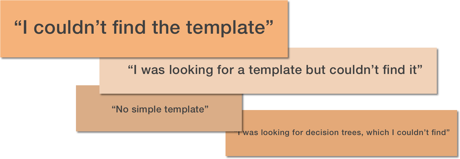
The data we were given by Lucid showed us that templates were in fact an important part of the diagramming experience, but the problem lay within users being able to find these templates.
Later data...
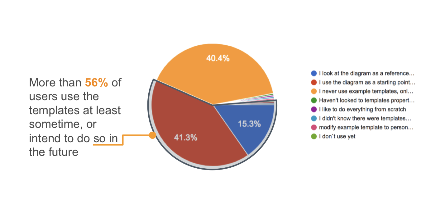
Data we were given later in the process told us that 35.8% of users wanted better preview images in the Template Picker. We were constrained from options such as adding a search feature (wanted by 40.2% of those surveyed) or changing the categories (20%), so we narrowed our focus to the preview images.
Two types of users to consider
A big challenge was finding a concept that would fit the needs of both types of users we were introduced to:
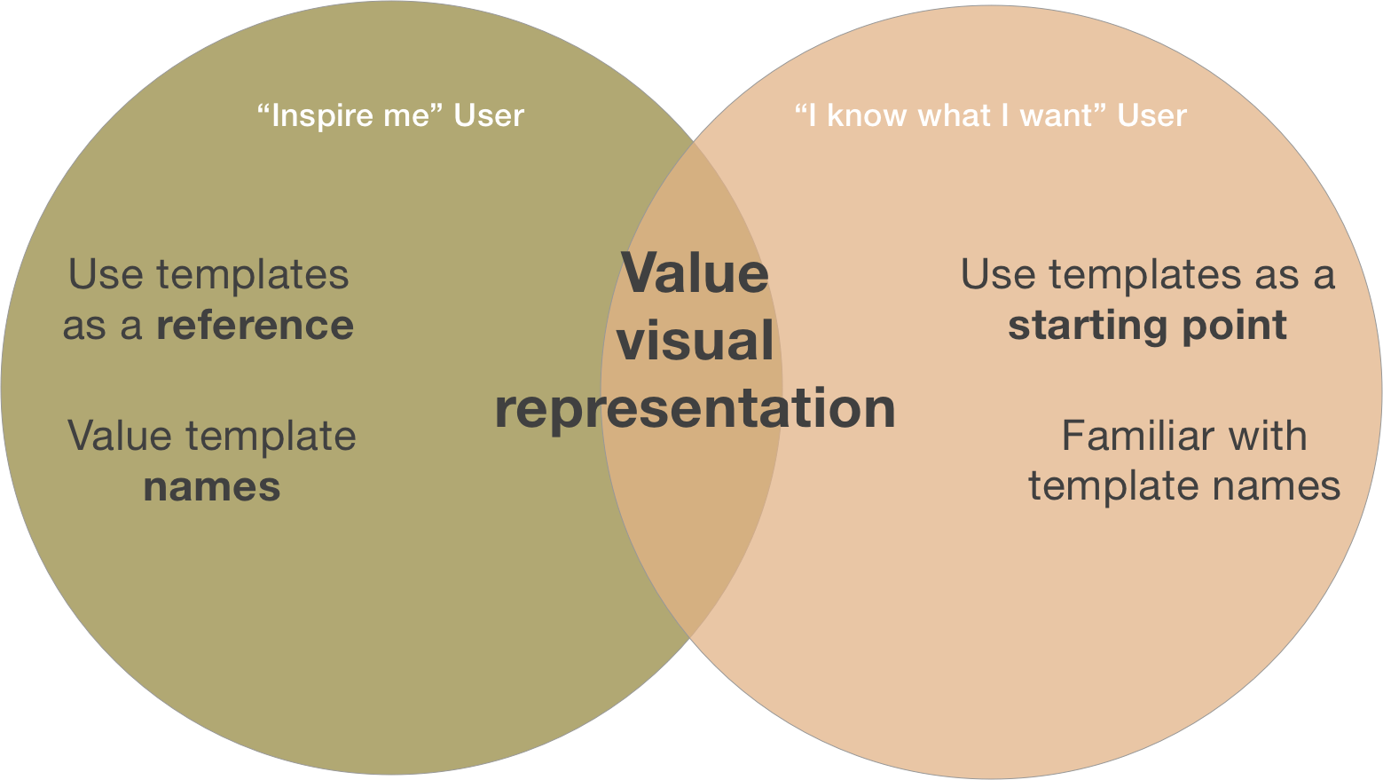
When we compared their needs, it became apparent to us that both user groups value visual representation. Because of this, we aimed to find a design that addressed visual representations of the thumbnails in a way that would benefit both types users.
Initial Concepts
In Figure A, users would get a preview of diagrams on the right panel when they hover over a thumbnail.
Figure B shows one of our beginning concepts in which the chosen diagram would show up as a dotted line that users could click on to keep certain parts of the diagram.
Some of our concepts explored how we could make interaction with templates easier in the actual document page when users are in the process of making a diagram (Figures B & D). These ended up being submitted as future considerations when we understood that we were to stick strictly to the Template Picker experience itself.
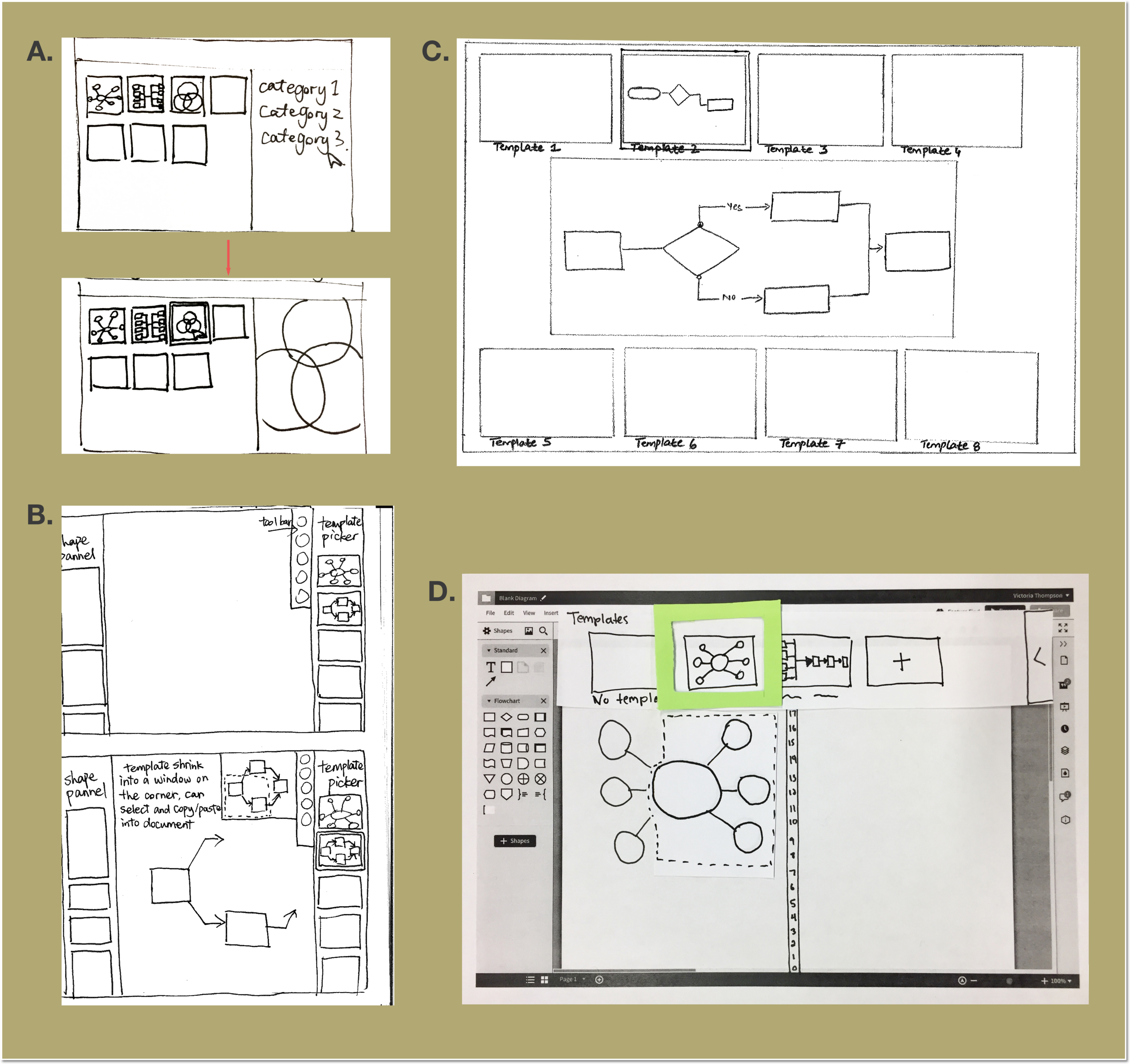
In Figure C, users clicking on a diagram thumbnail would pull the rows apart and bring up its preview.
Figure D shows our idea of having a split screen where users can drag and drop parts of diagrams they want to their side of the document.
Split Screen Concept
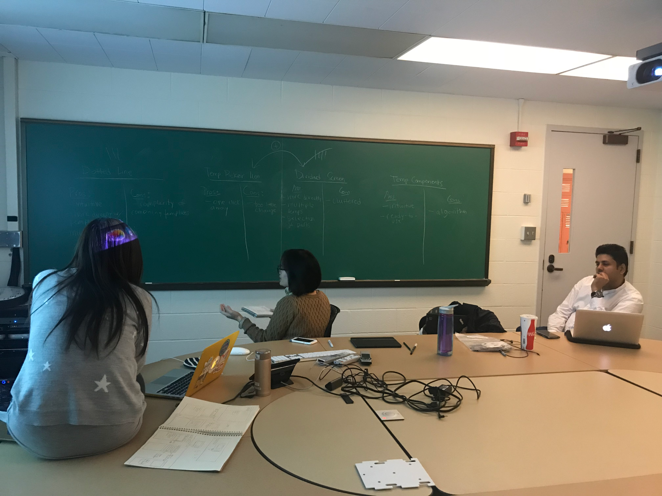
Brainstorming
What I learned....
You don't always need to go "above and beyond". When we began working, we came up with plenty of great ideas that we thought addressed all the problems expressed by Lucid about Lucidchart. On the contrary, we ended up wasting time outside of the bounds of what we were asked to accomplish. I realized that design isn't anything like school projects, where doing extra gets you points. Sometimes, you just have to stick to what's asked and leave the other stuff for another time.
Speaking up. This project definitely showed me the importance of speaking up when necessary. With limited time, it was important that I got out what I was thinking without leaving it for later, when it may be too late. Everyone's opinion matters because we are all coming from different perspectives. Never stay quiet!