Modern Gastroenterology, LLC
April 2024 - Present
Gastrointestinal health resources and consultation for both patients and providers, from the comfort of your home.
Modern Gastroenterology is a digital gastroenterology practice focused on personalized, high-quality care and consultation for both patients and providers. As the sole designer on this project, I led the creation of the brand's first digital presence—from early research to final implementation. The goal was to build a patient- and provider-facing site that not only communicated credibility and warmth but also made care easy to access, navigate, and trust.
Background
End-to-end designer
Research & strategy
Content & architecture
Interaction & visual design
Implementation & build
Accessibility & SEO
Role
Problem statement
Before this project, Modern Gastroenterology had no online footprint. Patients struggled to find reliable information, and referral forms were challenging to access. I was tasked with building an online experience from the ground up—one that made specialized care approachable, efficient, and aligned with the practice’s mission. Our primary objectives were:
Build trust through design
Translate the practice’s compassionate care philosophy into an empathetic and modern visual identity.
Design for continuity
Ensure patients experience a consistent, reassuring flow from MGI’s website to its external patient portal and partner sites.
Future-proof the experience
Create modular, easy-to-update templates that can scale with new providers, procedures, and locations.

Strategy
Foundational clarity
With no existing content or structure, I built the entire experience around a clear hierarchy—one that prioritized common patient and provider goals and minimized friction from homepage to action.
Emotional connection
GI care can feel clinical or intimidating, so we deliberately shifted the brand’s focus toward reassurance, empowerment, and caring for oneself and loved ones.
Accessibility & ease of use
From high-contrast colors to intuitive mobile layouts and screen reader–friendly markup, accessibility was baked into every layer of design, not added on later.
Tactics
Mapped pathways
I created targeted user flows based on real goals (e.g. booking an appointment, finding procedure prep info, submitting referrals) and shaped the IA around those, minimizing steps and decisions.
Reusable page blocks
Instead of one-off pages, I built a system of modular blocks—hero sections, testimonial quotes, accordions for procedures, CTA banners—that could be reused and rearranged as the site grew.
Embedded guidance
Key CTAs and support messages (like “Need help preparing?” or “Call us if you have questions”) were placed at points of friction, like before booking or after listing a procedure, helping reduce anxiety and dropoff.
Structured content
In collaboration with my client, I wrote all initial copy, focusing on brevity, clarity, and tone. I also used clear headings and progressive disclosure to let users skim or dive deep.
AI-assisted coding
I used a combination of my own front-end skills and AI to efficiently code interactive cards for the homepage. They feature smooth hover effects and visual styling that elevates the user’s first scroll, adding a modern, polished feel to help build trust from the start.
Responsive design
The site doesn’t just shrink down, it adapts. I tested all pages on my mobile device to make sure layouts don’t fall apart and calls-to-action remain front and center on all screen sizes.

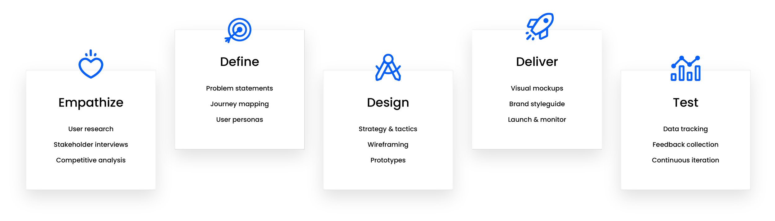
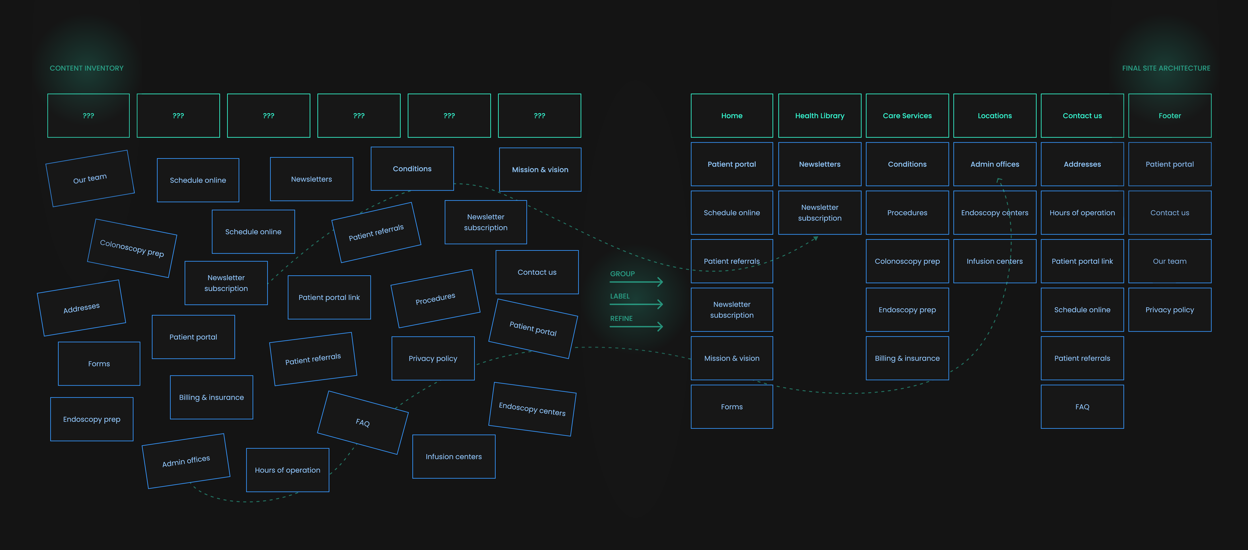
Card sorting activity
To establish an intuitive information architecture, I conducted a virtual card-sorting exercise to cluster related content and define clear navigation categories. This process transformed a scattered content inventory into a structured, patient-friendly sitemap.
Taking us from conceptual wireframes…
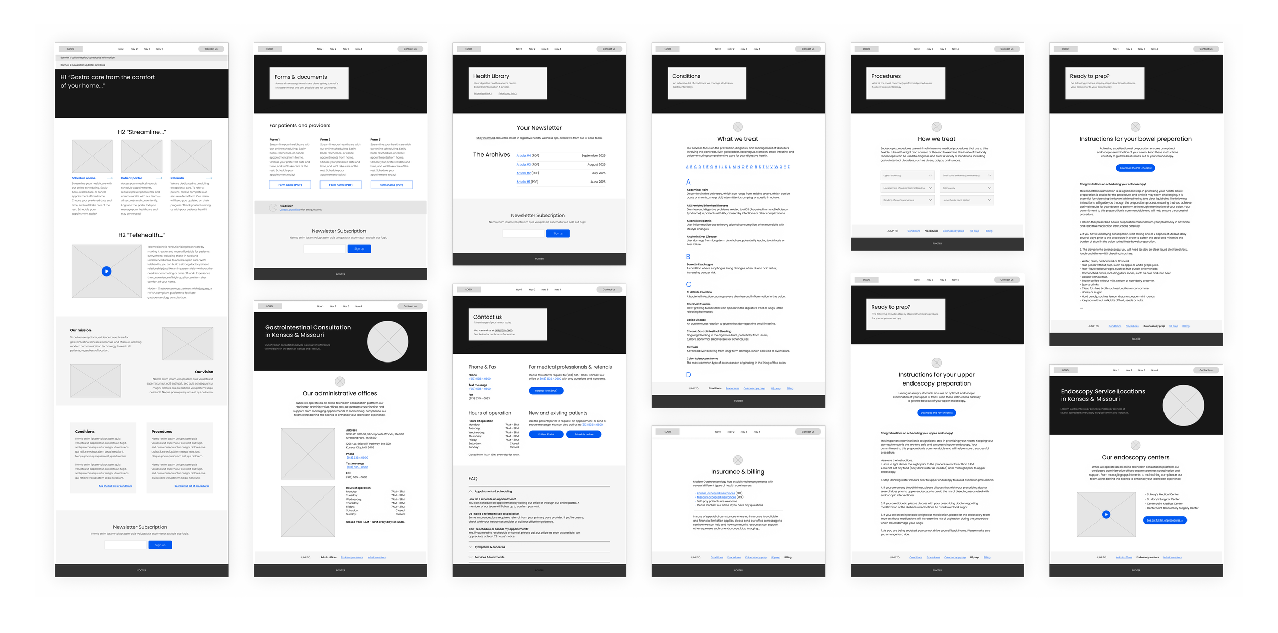
…to a responsive, intuitive digital experience
Features & affordances

Sticky header
Interactive cards
Partner highlights
Secondary navigation
Quick links
Anchor links
Digital + print content
FAQ section
Calls-to-action
While I did not conduct direct user surveys or interviews for this phase, I used website analytics as a quantitative proxy for understanding user behavior and validating design decisions. The data revealed clear patterns around engagement, access points, and device usage—providing actionable insights for future iterations of the site.
Data & analytics
Visits +181% YoY (1.7k): Since MGI had no prior site, the launch of course created a new entry point for patients. The growth reflects how the site became a channel for discovery.
Unique visitors +205% YoY (1.3k): First-time users were both landing via search engines and returning to explore, validating design decisions like SEO-focused service page titles and multiple navigation paths to key content.
Bounce rate ~62%: Higher than ideal, with the “one-and-done” nature of medical site visits in mind. Future improvements might include offering quick links in search snippets to better serve information lookup.
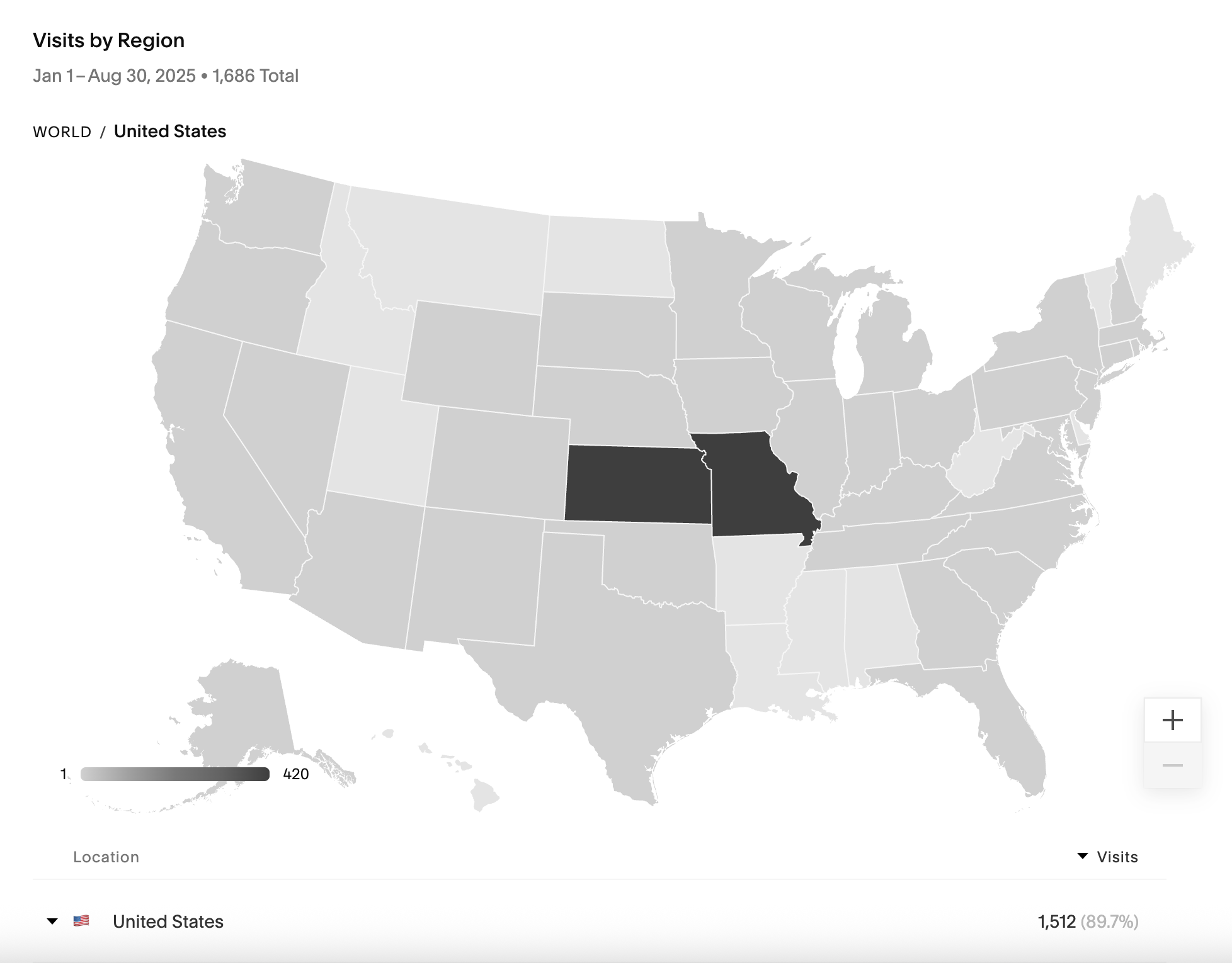
Geographic data shows that website traffic is most concentrated in Kansas and Missouri—the two states Modern Gastroenterology serves, validating that the site is reaching its target patient base and that SEO optimization efforts are effectively aligned with the practice’s geographic footprint
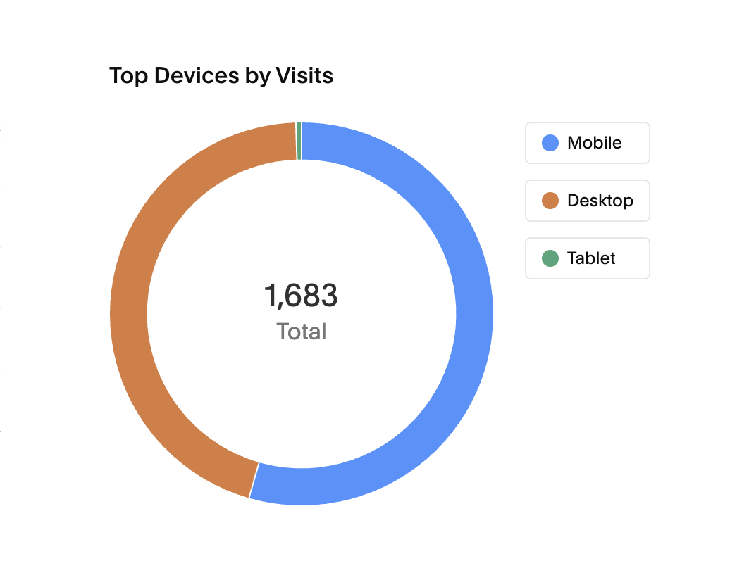
Mobile usage
To my surprise, mobile usage was the most prominent, confirming that mobile quality was just as crucial to the experience as desktop. While I initially assumed desktop would dominate given the patient demographic, analytics revealed a growing comfort with mobile access—a shift that reflects how patients now expect to manage their health with the same ease as any other daily task.
This insight reinforced the importance of designing with mobile-first principles: prioritizing legibility, quick loading times, and intuitive navigation for on-the-go use, ensuring that even a specialized medical practice delivers an experience that feels effortless across devices.
In retrospect…
Expansion via design thinking
Looking back, I see how deeply incorporating UX activities can broaden the way a designer frames and solves problems. Competitive analysis and content strategy helped shape early direction, but going further—through user interviews, journey mapping, or usability testing—could have uncovered even more nuanced patient and provider needs. The project reminded me that UX design isn’t just about making something intuitive; it’s about continuously deepening your understanding of the problem space, even when timelines or scope are tight.
Platform constraints
While building from scratch on Squarespace allowed for efficient development and a clean launch, it also came with inherent limitations. Custom functionality, performance optimization, and component flexibility were all bound by the platform’s structure. In some cases, I had to creatively work around template restrictions—like using custom code injections and AI-assisted coding—to achieve the desired level of interaction and polish. The experience reinforced the importance of understanding a platform’s constraints early on, and designing within (or strategically around) them to maintain both quality and feasibility.